Retreat West 'What Was Left' Anthology Launch at Waterstones

Last night's launch party for the Retreat West Books What Was Left Anthology was held at Waterstones Reading - a wonderful location - and was a celebration of the first collection of stories from the inaugural Retreat West Short Story Prize and Flash Fiction Prize 2016.  

The Retreat West Books Anthology, edited by Amanda Saint and Jane Elmor

The Retreat West Books Anthology, edited by Amanda Saint and Jane Elmor

Amanda invited me to read my story 'On Crosby Beach', which won 1st prize in the RW Short Story Competition 2016.  It was a delight to do so before the assembled audience - even though a little nerve-wracking!  The story was inspired by my childhood visits to Crosby Beach and also by the 'Another Place' installation there, by Antony Gormley, most definitely worth a visit.

Reading my short story 'On Crosby Beach'.

Reading my short story 'On Crosby Beach'.

Jude Higgins also read her 1st prize winning RW Flash Fiction flash, which was haunting and memorable ...

Jude Higgins read her flash fiction 'At The Hospital' ...

Jude Higgins read her flash fiction 'At The Hospital' ...

Attending a launch is a brilliant chance to meet fellow writers and to sign books.  Amongst the assembled company were writers Jude Higgins, Mandy Huggins, Joanna Campbell, Angelita Bradney, Heather Walker, Diane Simmons and Stephen Palmer, all of whom have fiction in Anthology.  For me, it was also fantastic to meet Amanda Saint, who runs Retreat West with incredible efficiency and genuine passion.  Thanks Amanda and Retreat West!

IMG_0309.JPG

1st Prize - Lorian Hemingway Short Story Competition 2017

I was so delighted to hear that I've been awarded 1st Prize in the Lorian Hemingway Short Story Competition 2017.  This year there were 650 entries from the USA and worldwide, so it was a great thrill to receive a personal email from Lorian letting me know that my story 'Welcome to Legoland' had won.  She wrote:

'I absolutely loved "Welcome to Legoland" ... Your story hit me in that spot in my chest that aches when a story evokes emotion so authentically.  For the 37 years of this competition I have trusted that instinct and it has yet to let me down. Such a beautifully rendered work.'

A vintage Leica camera features in the story ... which is set in 1970s Runcorn New Town.

A vintage Leica camera features in the story ... which is set in 1970s Runcorn New Town.

Lorian is the Director and Final Judge of the competition - so thank you Lorian! - and to Dr Rob Merritt, also on the longtime judging panel.  Congratulations to the other winners and honourable mentions, too.  'Welcome to Legoland' will be published in Cutthroat: a Journal of the Arts in Winter 2018.  

A Vintage Canadian Lake Cottage

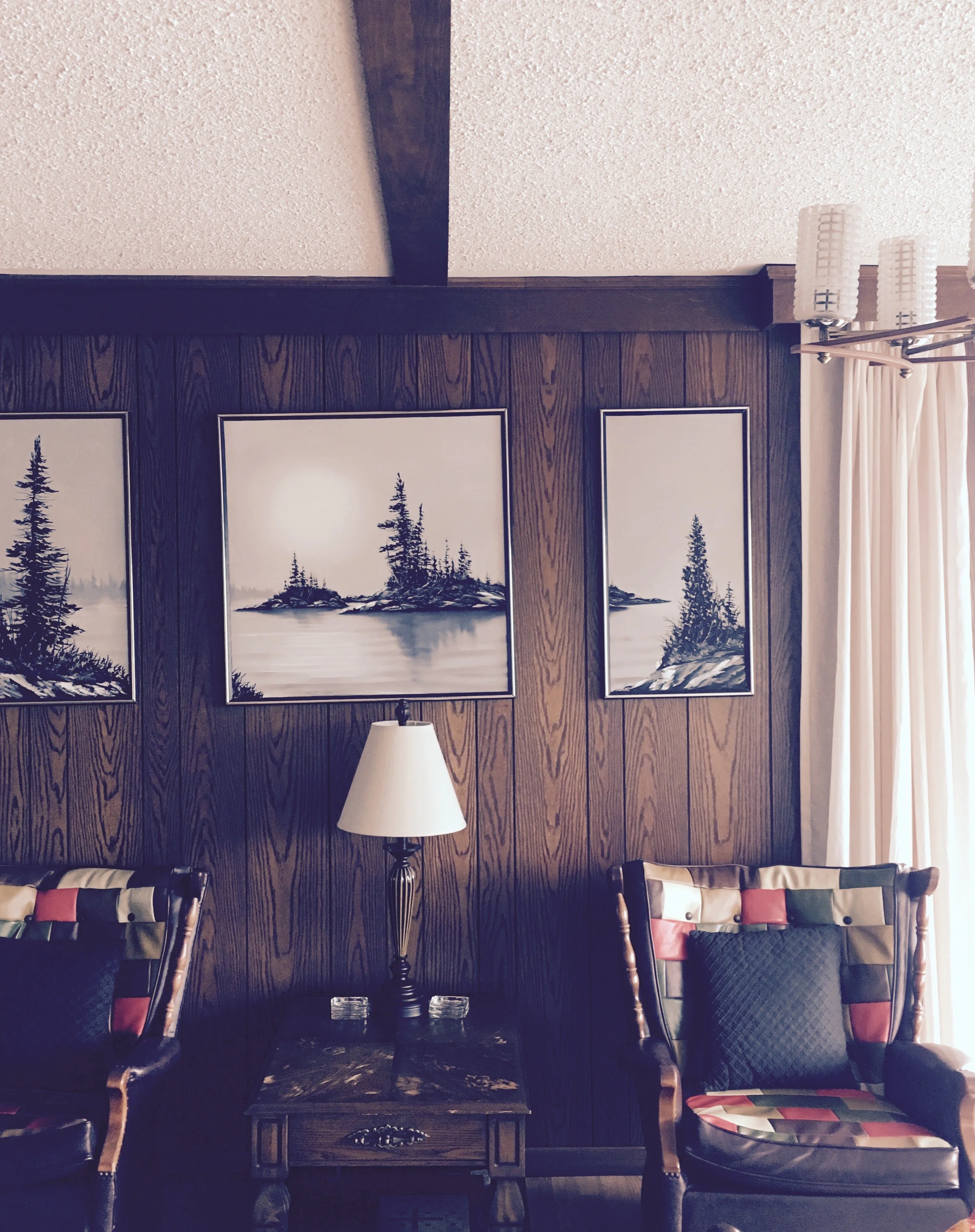
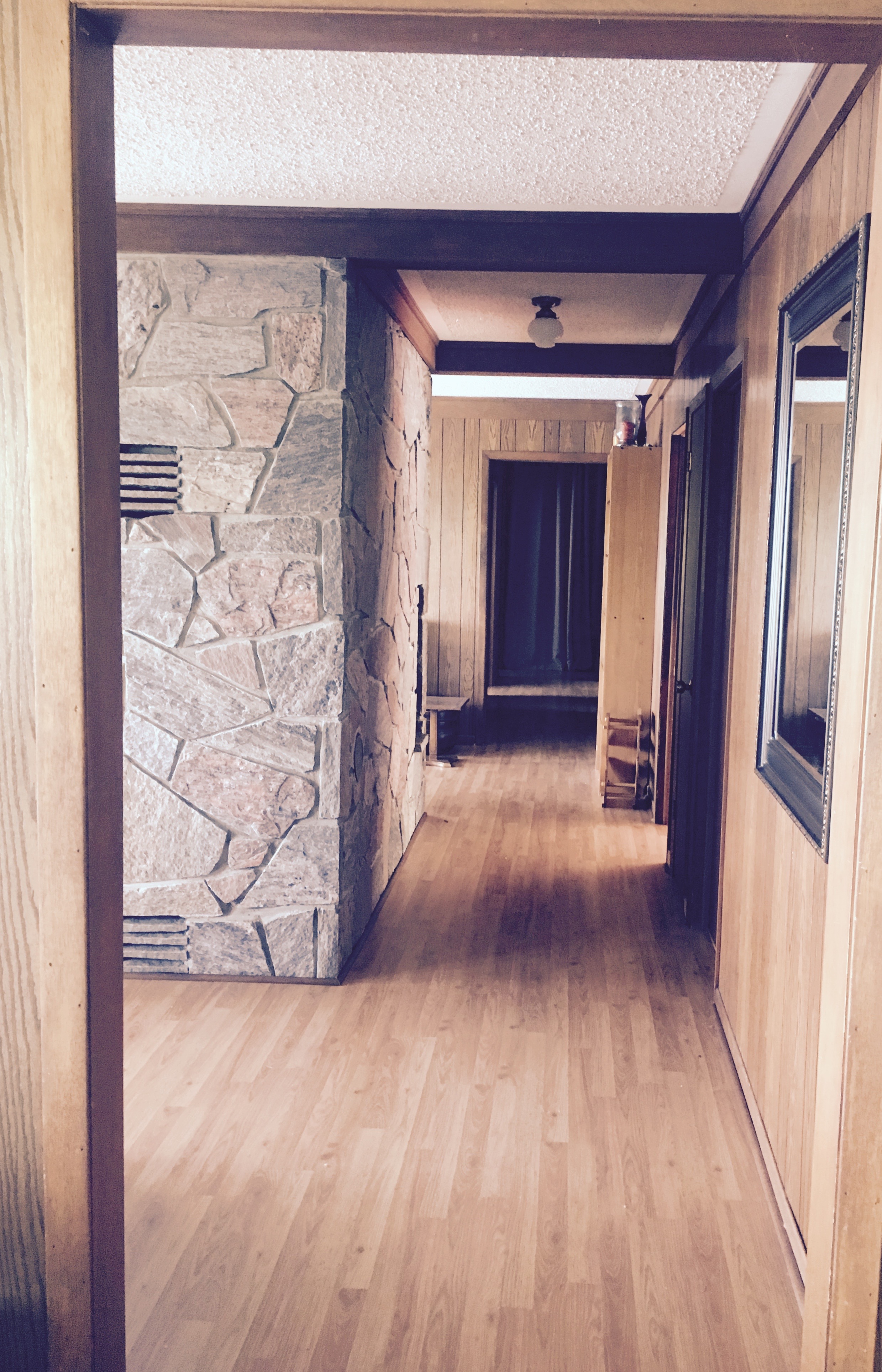
I've just returned from Canada, where we were lucky enough to rent a lakeside cottage.  The current owners bought the house two years ago, but this amazing bungalow was originally built in 1967.  Its design and contents (right down to olive green kitchen appliances, a lilac bathroom, Sixties art and jazzy patterned china) have all been perfectly preserved over the decades - and being here was like stepping back in time - in a good way. 

Patchwork leather armchairs beneath lake-inspired art ...

Original kitchen fittings ...

Perfectly preserved original leather sofas ... and light fittings ... and a sparkly ceiling at night ...

Timber panelling mixed with stone cladding ...

Seeing this beautifully preserved house really made me think hard about today's current design obsession for chucking things out, and the need to constantly update.  If the original owner had done something similar, this wonderful place wouldn't still be here to enjoy.  Interested?  More details about Solklint Cottage here

Styling Interiors for Photoshoots/BIID/May 2017

It's always a pleasure to deliver the Styling Interiors for Photoshoots workshops for the British Institute of Interior Design (BIID).  This Wednesday I did two sessions.  We started with coffee/tea and a catch-up so I could get to know the designers attending.  With the workshop divided into three parts, the initial focus was on why doing professional shots is essential, a look at the stylist/designer-photographer relationship and the practicalities of a shoot:

Image from Think Home (Ryland Peters & Small) Photography Polly Wreford

Image from Think Home (Ryland Peters & Small) Photography Polly Wreford

We moved swiftly on to looking at 'thinking like a stylist.' I'm always keen to get designers to tap into styling as a skill very different to interior design: we focussed on examples of what works, and what doesn't, before moving on to perfect accessorising and room-by-room tips:

Image from Casual Living (Ryland Peters & Small) Photography Polly Wreford

Image from Casual Living (Ryland Peters & Small) Photography Polly Wreford

Then it was time for another coffee/tea break!  And only BIID would display it in such a tempting manner:

IMG_7668.jpg

For the final part of the workshop, we discussed how to approach a magazine with a potential project, and what publications are looking for.  This week's sessions were great fun, and hopefully everyone learned some useful tips.  I particularly love to hear back from designers after they've attended.  Kate Morris, of 102 Interiors, wrote:  'Thank you for yesterday's course.  It was thought provoking and I thoroughly enjoyed the event itself.  I've been messing about with my house since I got home yesterday, moving things and squinting at vistas!'  

And after all, having a sense of fun and experimentation, is what photographic styling is all about!

Image from Think Home (Ryland Peters & Small) Photography Polly Wreford

Image from Think Home (Ryland Peters & Small) Photography Polly Wreford

Shop Local

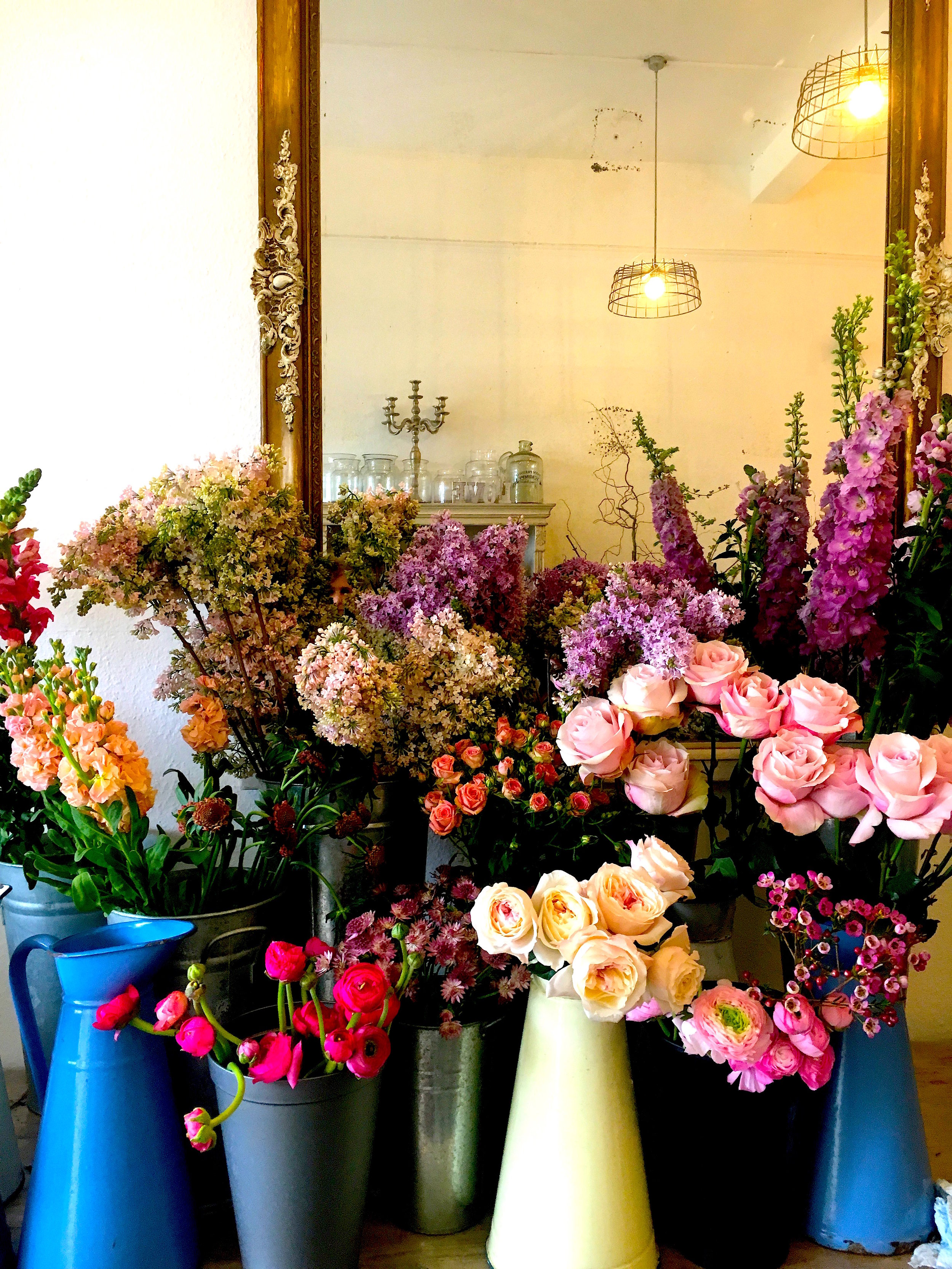
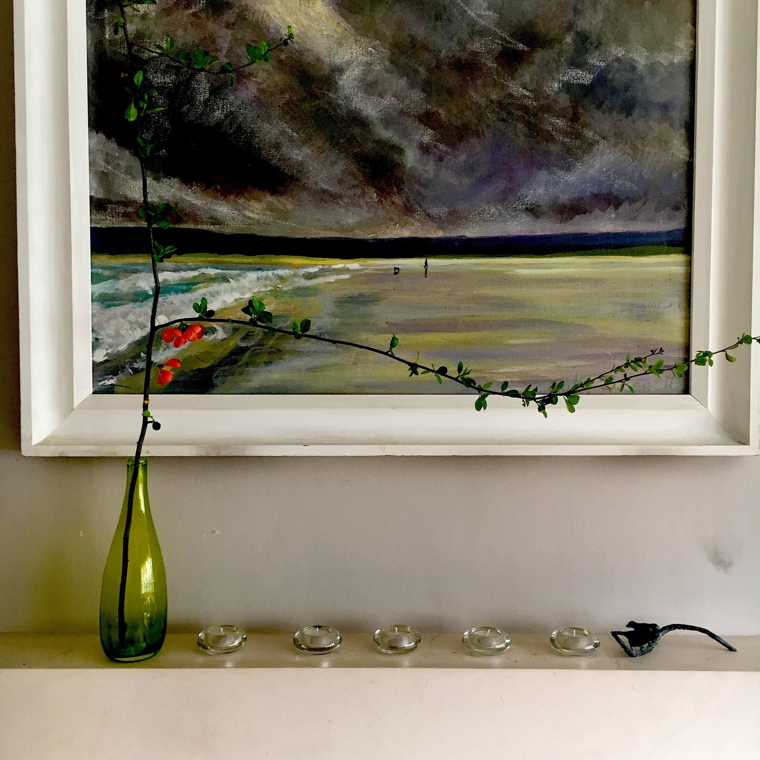
I'm a great believer in supporting local shops and industries.  Now spring is here, it's a delight to have The Blue Lavender so close by in Barnes Village: there's always a fabulous selection of seasonal flowers inside (see below) and out.  Over the years, especially whilst choosing flowers for shoots, I've become particularly keen on florists who a) show an innovative range and b) know their stuff about flowers.  Sometimes, I'll go for just a couple of stems: blossom and leafy twigs can be as effective as a giant bunch.

Tones of pink at The Blue Lavender in Barnes Village

Tones of pink at The Blue Lavender in Barnes Village

The power of one or two branches

The power of one or two branches

Styling Talk

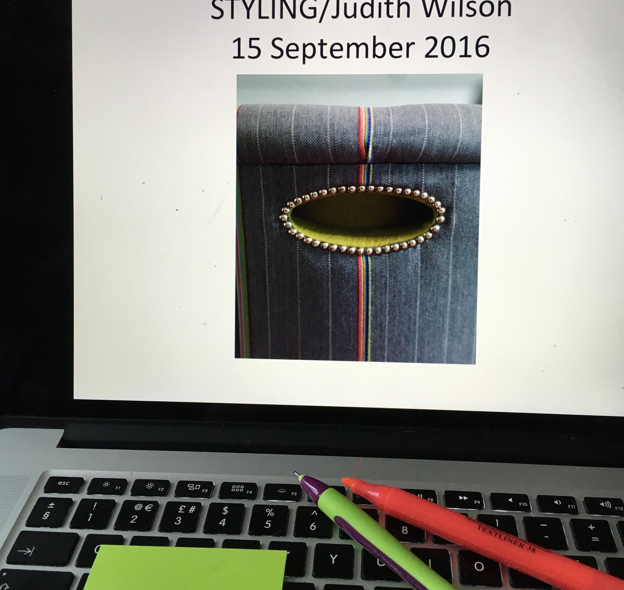
Last week, I was invited by a central London design team to give a talk on Styling.  There's nothing quite like amassing a selection of visuals, and analysing the styling of those photos - rather than the decoration  - to focus the mind.  Why does a particular image work?  How do the props make it welcoming yet serene?  What's the secret to a perfectly balanced photo?

I like to think of styling as a 'visual tidying up', the crucial setting of ambience, and the creation of an image that you'll look at once, twice - and perhaps a third time, peeling back the photo in layers.  

This is one of my favourite images from my book, Think Home (brilliant photography by Polly Wreford, published by Ryland Peters & Small).  The mood here is tranquil, there's a clever (and inexpensive) decorating idea and the eye can br…

This is one of my favourite images from my book, Think Home (brilliant photography by Polly Wreford, published by Ryland Peters & Small).  The mood here is tranquil, there's a clever (and inexpensive) decorating idea and the eye can breathe.  

All In The Detail

It must be the onset of September (and with it the dreamy promise of autumn tones), but this month I'm focussing on intense slate blue and acid yellow.  In anticipation of my newly revamped sofa (almost complete, not quite) I've treated myself to one of Kirsten Hecktermann's glorious double-sided velvet cushions.  The subtlety of colour in her dyed velvets is fabulous.  Next up, I might just have to invest in the Smokey Blue ...

Double-sided velvet Kirsten Hecktermann cushion in Lemon Yellow

Double-sided velvet Kirsten Hecktermann cushion in Lemon Yellow

The ultimate labelling for no-logo fans: neatly tucked within the zip enclosure

The ultimate labelling for no-logo fans: neatly tucked within the zip enclosure

Kissing Fish

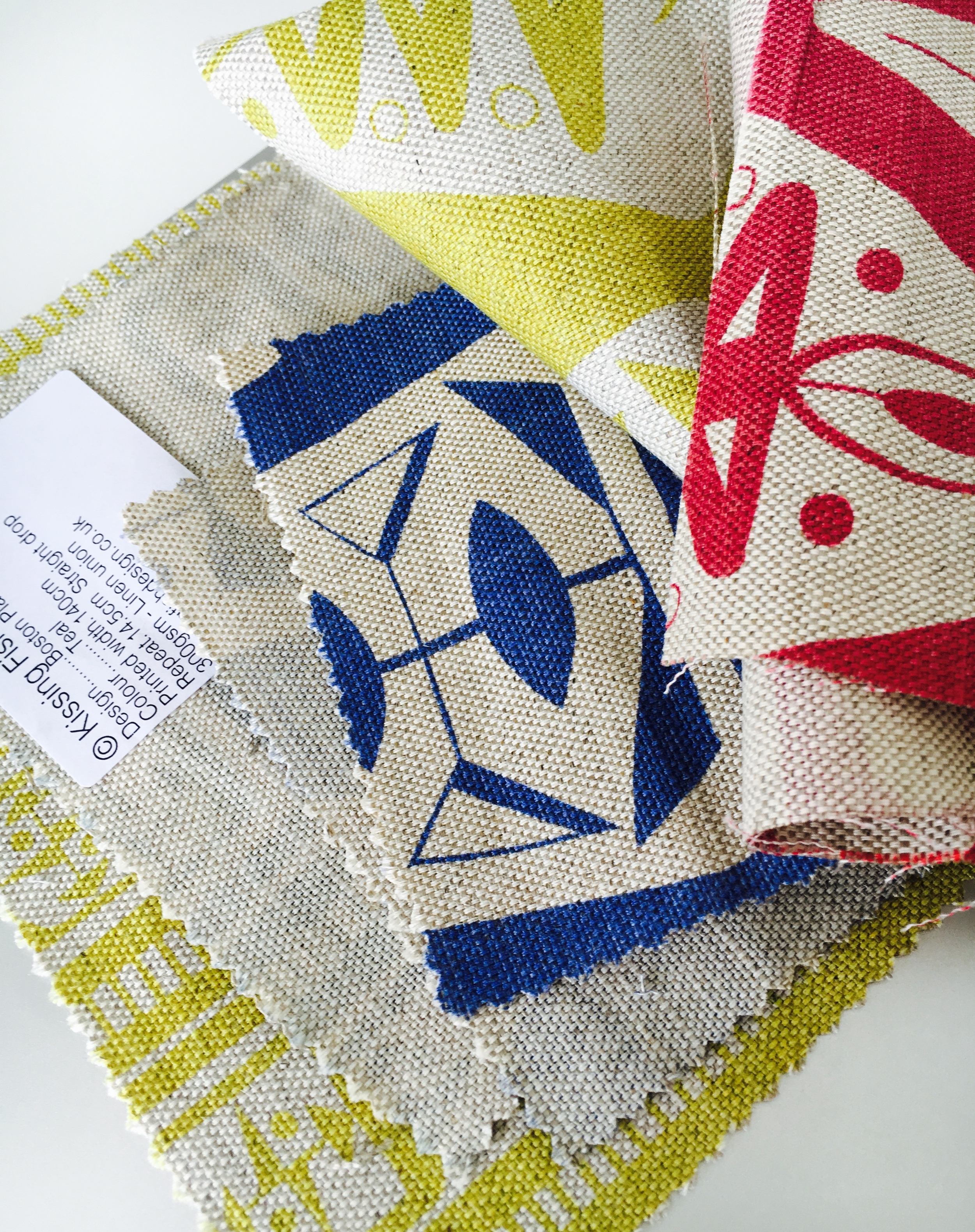
In my hunt for new home-grown textile companies, Kissing Fish is my latest find.  (Their fabrics are realized in colourways with names like Bitter Lime - how could I resist?)  Not only are the linen unions fabulously mid-20th century, but there's a wonderful story behind them. The designs were originally created by Michael Nicholson, uncle of Ben Nicholson (one half of the Kissing Fish duo) - and were discovered in a forgotten portfolio ... read more about it here.

Shown here are 'Boston Place' and 'Dorset Square' designs in Bitter Lime, Blue and Red

Shown here are 'Boston Place' and 'Dorset Square' designs in Bitter Lime, Blue and Red